
Prompt You'll Actually Use
Hide the title before you trust the slide
Your audience reads the shape before the words. If the shape tells a different story, the title loses.
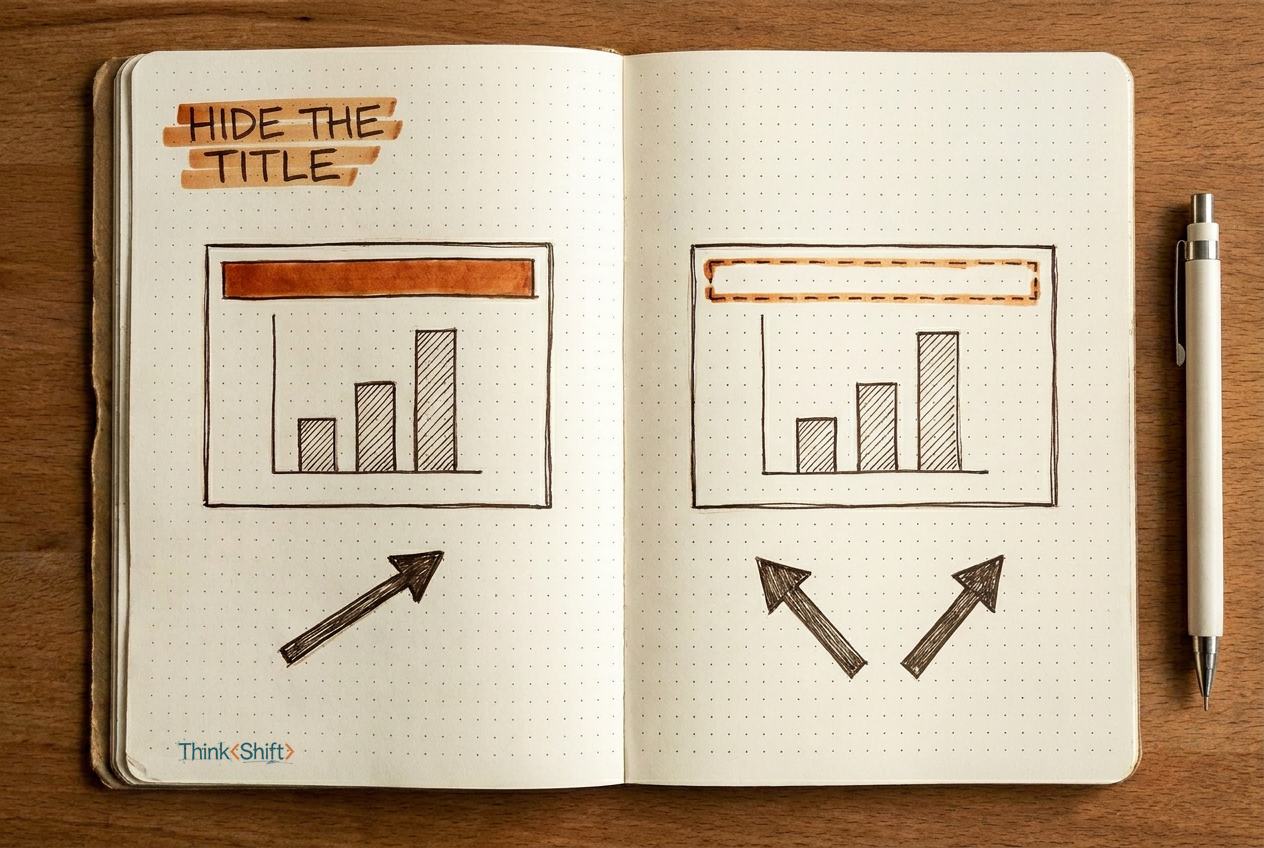
The move Before you present a chart, strip the title and ask AI what the data says on its own. If the blind read doesn't match your intended claim, the visual isn't carrying your point.
The short version: Asking AI "does this look clear?" checks whether the title matches the data. It doesn't check whether a viewer would draw your conclusion from the data alone. Hide the title, ask for a cold read, and compare.
You built the chart and wrote the title. You pasted both into AI, asked "does this look clear?" and it said yes.
That yes means the title and the chart agree. It does not mean the chart makes your point on its own.
A slide that needs its title to make its point hasn't made it yet.
Your audience sees the shape of the data before they read the words above it. If the shape tells a different story, the title is what they'll argue with.
The move
Before your meeting, tell AI to ignore the title and read the chart cold.
Look at this chart as a first-time viewer. Ignore the title. Do not use any
prior context about my argument.

If you cannot clearly read the data, say so before interpreting.

1. What is the first conclusion the data and layout communicate on their own?
2. What is one alternate reading a reasonable colleague might hold?

My intended claim: [a specific assertion, e.g. "Western region retention
recovered in Q3," not just "the data looks good"]

Does the visual support my claim, or does it argue for a different conclusion?
Name the specific bars, lines, or layout choices that help or hurt.

[paste your chart or screenshot here]
Filled in, it looks like this:
[Pasted: a grouped bar chart showing Q2 vs Q3 client retention rates for four
regions. Western region went from 68% to 71%. Eastern region: 82% to 84%.]

My intended claim: Western region retention recovered in Q3.
First read: Eastern region has the highest retention in both quarters and dominates the chart.
Alternate read: Western region shows the largest percentage-point gain, but still trails every other region.
Verdict: Your title says "recovered," but the visual's dominant feature is East's two tall bars. The Western gain is real but small next to the tallest columns. A viewer scanning the chart sees a leader, not a comeback. To support "recovery," isolate the Western data or show the change as its own visual.
Why this helps: you find out whether the chart argues for your conclusion or against it, before someone in the room does.
The catch
AI is reading a flat image, not sitting in the room. It can miss context a colleague would bring, or overreact to a visual pattern your audience already understands. Use the blind read to find the gap, then make the call yourself.